Today, we will be discussing about the three main concerns for the web versus print documents.
First, it’s the body structure. Web users usually skim through content, unlike print document readers who are usually controlled by the paper (Kelly, R 2003). According to Nielson, J (2006), a research on eyetracking has shown that most users to read on the web scan through the text with the shape of an ‘F’. Strong subheads would be much needed to engage the reader’s attention amidst the scanning.
Unlike web design, print document designs are different although they would also have a non-linear design. It engages the reader’s attention through an entry path, while being observed as a whole (Visual Communication 2009). Hence, print documents have to be balanced visually with white spaces to allow eye rest for better information consumption (Pearson Custom)

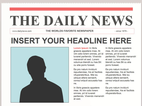
(Print) : Readers eyes would be fixated at the headlines. Entry paths would begin through the dramatic photos, leading them down.

Second, it’s accessibility. Online publishing is very convenient for readers to skim through. Readers will be lead to various pages at any instant through embedded links. Hence, if a writer or web designer wants their content to be read – it would be advisable to place it at the right bottom, where eyes land last (Kerry, R 2003). As for print documents, readers are inclined to linear reading. Aligned and neat subheadings would be encouraged for comfortable eye accessibility.

Third, it’s the typography. Sans serif fonts are used in web design as it appears neater and legible on monitor display (Benetos, K 2005). The idea here is that serif fonts shift the reader’s attention to the content, rather than the layout. That being said, designers also have to consider the content of the medium before deciding on the font (Learn Web Development) .

Web : Are you liking the fonts? Do they complement the content so much better?
Print : Significant approach of typography, neater for reading on hands with naked eyes
REFERENCES
- Benetos, K 2005, Design Considerations when writing : Print versus Screen, Accessed 25 August 2011, Available at http://tecfa.unige.ch/staf/staf-k/benetos/staf13/per5/lire.html
- Kelly, R 2003, Web Writing vs Print Writing, Accessed 25 August 2011, Available at http://www.kerryr.net/webwriting/guide_web-vs-print.htm
- Learn Web Development, Web Design Basics: Typography and Layout, Accessed 25 August 2011, Available at http://www.learnwebdevelopment.com/2011/08/web-design-basics-typography-and-layout/
- Nielson, J 2006, F Shaped Pattern for Reading Web Content, Accessed 25 August 2011, Available at http://www.useit.com/alertbox/reading_pattern.html
- Pearson Custom,Effective Print Document Design, Accessed 25 August 2011, Available at wps.pearsoncustom.com/wps/media/objects/3388/3469470/ch35.pdf
- Visual Communication 2009, Entry points and reading paths on newspaper spreads: comparing a semiotic analysis with eye-tracking measurements, Accessed 25 August 2011, Available at http://vcj.sagepub.com/content/5/1/65.abstract


